Redesigning a Rental Booking Platform for Scale & Conversion
A consulting-style redesign of a live booking experience—balancing speed, real constraints, and a scalable design system foundation.
Executive Summary
- Redesigned a production booking flow to improve clarity, trust, and consistency across key conversion steps.
- Worked under fast agency constraints, using heuristic evaluation + pattern benchmarking instead of full research.
- Delivered a token-ready component foundation to support future rollouts and white-label scalability.
Context & Problem
The platform had grown organically, creating fragmented patterns across search, filters, and booking. Users faced
friction in decision-making and form completion—especially on mobile.
- Goal: reduce friction from Search → Details → Booking
- Goal: increase trust and “choice confidence”
- Goal: set a scalable UI foundation for future client rollouts
Constraints
- Fast delivery timeline (agency production pace)
- Limited time for interviews / usability studies
- Existing backend rules + technical constraints
- Multiple stakeholders and iterative client feedback
- Design-to-dev handoff + QA under real deadlines
Approach
Without heavy research, I used a pragmatic, evidence-informed process:
- Heuristic evaluation (usability + consistency)
- Competitive & pattern benchmarking (industry conventions)
- Flow mapping (critical path focus)
- Component-first UI design to maintain consistency
- Token-ready system foundations (spacing, type, color)
- Handoff specs + QA checklist for dev alignment
Key UX Decisions
Design System Foundation
Built a baseline system to support consistency, faster iteration, and future white-label adaptability.
- Tokens: spacing, typography scale, color roles, radius
- Core components: buttons, inputs, cards, badges, alerts
- Patterns: filter blocks, pricing breakdown, stepper states
- Responsive rules for key layouts
- State design: loading, empty, error, success
- Handoff: naming, specs, and QA checklist
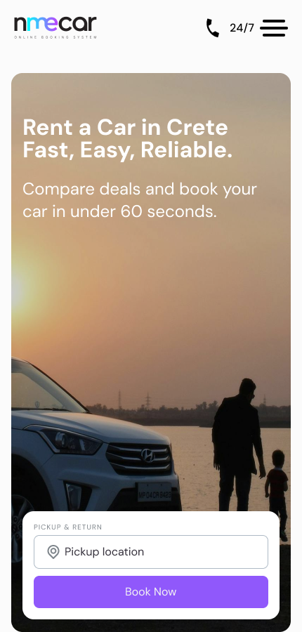
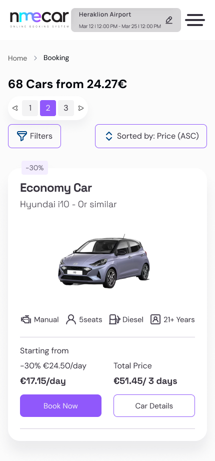
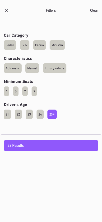
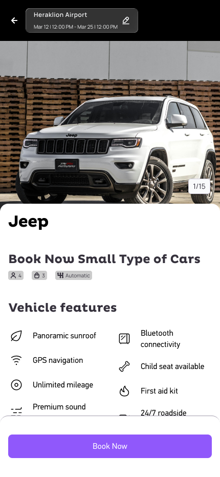
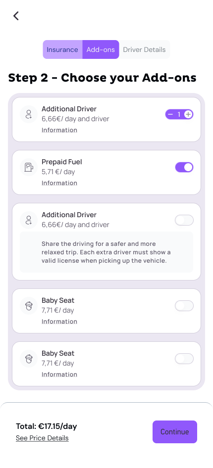
UI Highlights
A few screens that showcase the redesign direction and system consistency.
Outcome & Impact
- Delivered a full responsive redesign ready for development and rollout.
- Improved consistency across the platform via reusable components and token logic.
- Set a scalable foundation for future client implementations under the same product line.
- Next: measure impact post-launch (conversion, drop-off points, engagement).
*Due to client/agency context, detailed analytics and exact numbers may be limited or shared in a follow-up discussion.
Learnings
- How to drive UX decisions when full research isn’t feasible.
- How to ship faster using system thinking (components + tokens).
- How to align stakeholders with clear “decision + trade-off + outcome” framing.